Friday, 19 December 2008
Friday, 12 December 2008
Interactive Narrative
Well basically my Interactive Narrative Project is done, but my Internet at my house is so bad i cant upload it onto deviantART.com so going to have to wait until tomorrow now and do it in the library!
At first when given the project brief i was struggling to think of any ideas for my project. I wanted to do something that i was interested in because i knew this would motivate me to make this project good. After scribbling down some ideas and looking at other peoples Flash projects on the Internet I decided to make a quiz style game in flash for my project. I wanted to think of something that kept the user involved and interacting with the movie. I thought by having a quiz format i would achieve this. I wanted a subject that i felt quite passionately about and was interested in, so i chose to base it on football and the English Premier League to be precise.
It was a long and painful process creating my flash movie. I had never used Flash before this and found it very complicated and confusing. The interface is similar to other Adobe programs and is full of different buttons and functions. At first it is very daunting and i didn't know where to start! However, once i started clicking and looking at different things i soon began to understand what different functions that it had and what could be achieved with the program. I watched many different tutorials through the NOW which i found extremely useful. The tutorials i watched were very detailed and showed the user how to do basically anything they wanted in the program.
I spent such a long time creating my interactive narrative. The main reason for this is that i was completely new to the program and had to do everything slowly. The smallest mistake or wrongly pressed button resulted in my movie being completely messed up and caused it to stop working on many different occasions. However, when i finally got the hang of it i started to enjoy using the program and the different things you could do with it.
i am quite please with the outcome of my project and think i have made quite a good Flash movie. I am now waiting to upload it onto the Internet via the library (thanks to my rubbish house Internet!).
Monday, 8 December 2008
Interactive Narrative: www.bluu.co.uk
The home page gives you a selection of a specific restaurant in different places. When you choose a city it takes you to a page which makes it appear that you are in the restaurant itself. It has the bar and also seats which act as links to other parts of the website. The only way to navigate through the website is clicking on the different parts of the restaurant which then opens new links and takes the user to different parts of the website.

This specific website uses a picture of the venue itself. Each different part of the picture has then been made into an animated link which lights up and displays a caption telling the viewer what the link is and where it goes to. There are also lights in the restaurant which turn on and off when you scroll over them. There isn’t much sound on the site apart from very quiet background noise and quiet music in the background. There is however a noise when you navigate from page to page. The best part of the site I believe is the menu section. In the bar there are menus on one of the tables, when this is selected it brings up a menu that is made to look like a real life book type menu. Then you can select the corner of each page and you then drag it down and across to change page, there is also a sound with this which makes it sound even more realistic.

The menu is again similar to the other two. It is an environment which allows the user to freely navigate around the site; they are not confined to menu bars. The each link becomes highlighted when rolled over which clearly shows the user what is a link and what isn’t. The main audience interaction is the food and drinks menu. The menu allows the user to flick through manually using the mouse.

This specific website uses a picture of the venue itself. Each different part of the picture has then been made into an animated link which lights up and displays a caption telling the viewer what the link is and where it goes to. There are also lights in the restaurant which turn on and off when you scroll over them. There isn’t much sound on the site apart from very quiet background noise and quiet music in the background. There is however a noise when you navigate from page to page. The best part of the site I believe is the menu section. In the bar there are menus on one of the tables, when this is selected it brings up a menu that is made to look like a real life book type menu. Then you can select the corner of each page and you then drag it down and across to change page, there is also a sound with this which makes it sound even more realistic.
The menu is again similar to the other two. It is an environment which allows the user to freely navigate around the site; they are not confined to menu bars. The each link becomes highlighted when rolled over which clearly shows the user what is a link and what isn’t. The main audience interaction is the food and drinks menu. The menu allows the user to flick through manually using the mouse.
This is a website advertising a restaurant/bar available for bookings.
Interactive Narrative: www.seabrookscrisps.com
I like this website because of the way it is all laid out. It has graphics at the back and towards the front and at the back of the page. It is made to look like a village set out in the hills. As you move the mouse around the page the different icons become bigger and are highlighted telling the user what each button links to. The menu is spread out all over the page around the village making the user want to explore around the page and use the different links, however there are also quick links at the top and at the bottom of each page, ensuring that certain users who don’t want to spend time browsing the site can get to where they want quickly.

I really like the images on the website. Most of the images are used as links and also move when highlighted by the mouse. The images are really big and clear and easy to see what each thing is. Towards the top of the home page there is a plane that flies past on a loop displaying a banner advertising the different flavours of the crisps. This really catches the viewer’s eye.

When a link is clicked on the page becomes dull and closes into the centre. The new page then opens and brightens from the centre. There is also video on each page, its only little things, like a crisp van driving down the road or the sun’s rays rotating but it adds to the atmosphere of the website.
There are also a few sounds on the website, however, it is mostly background noise. When outside in and around the village environment there are bird noises and also the occasional car noise. The plane also makes a noise when it flies overhead.
When in the Seabrooks shop when a certain packet is highlighted, the shop keeper tells the viewer what each flavour is in a Yorkshire accent and the product is highlighted and becomes larger.

I really like the images on the website. Most of the images are used as links and also move when highlighted by the mouse. The images are really big and clear and easy to see what each thing is. Towards the top of the home page there is a plane that flies past on a loop displaying a banner advertising the different flavours of the crisps. This really catches the viewer’s eye.
When a link is clicked on the page becomes dull and closes into the centre. The new page then opens and brightens from the centre. There is also video on each page, its only little things, like a crisp van driving down the road or the sun’s rays rotating but it adds to the atmosphere of the website.
There are also a few sounds on the website, however, it is mostly background noise. When outside in and around the village environment there are bird noises and also the occasional car noise. The plane also makes a noise when it flies overhead.
When in the Seabrooks shop when a certain packet is highlighted, the shop keeper tells the viewer what each flavour is in a Yorkshire accent and the product is highlighted and becomes larger.
The menu navigation is similar to the Kanye West website. The way the links are on the page is the same, an outside environment which allows the user to freely navigate through the website without being given a specific menu layout. When each object is clicked it becomes highlighted and then each new page is opened. By having the menu set out in a village it encourages the user to browse through the site and click on each different link.
The website is advertising and selling a food product.
The website is advertising and selling a food product.
Interactive Narrative: www.KanyeUniverseCity.com

This is Kanye Wests’ official site. When you first open the website you are greeted with a welcome page, it has many different TV screens which you cannot click on. The only button you can press is ‘ENTER’. Once you have entered the site on the same computer for the second time this page is left out and you travel straight to the ‘City’ page.

The thing I like about this page is the choice of colours. The designers have chosen to use bright colours that really stand off the page and make the whole thing look very appealing. The site uses mainly bright pink, mixed with blues, yellows and reds.
When moving the mouse around the website you move around the City, it moves from left to right showing different buildings and structures which then link to different parts of the websites. When you stop and hover over each object the movement stop and a pop-up is displayed telling the viewer where the link goes.
The site is constantly flashing and there are objects moving round the screen at all times making the viewers eyes wander around the screen looking at all the different parts of it.

There are two main parts of the website. Being a hip-hop artist the biggest part of the site is the music section. On this section the user can look through the different albums Kanye has released and also listen to and buy any of the music on these albums. This is presented in a traditional jukebox style format. When you click on the different parts of the jukebox the album covers are displayed and can be navigated.

The other main part of the website is the online store. This part is divided into 3 main sections, these are Book, Music and Merchandise. These 3 sections are displayed in 3 different towers, getting larger from the back of the page.
What i changed in my One Shot Film.
My One shot film was created as two different files. I had an .avi file which contained the video but also the background sound and many different .wav files which contained the voice overs and other sounds to edit into the film.
The .avi file had two runs of the film rolled into one video, firstly i had to cut out the run that i didn't want. i decided to use the second run, therefore i cut out the first one. This made the total running time of the film about 1 minute 20 seconds.
My next task was then to add my sounds into premiere. Before i added the files into my video however, i needed to delete the video sound track so that the sound files could be heard clearly and wouldn't clash. The sound files themselves needed cutting down in premiere because the sounds recorded had some talking before and after the actual line needed. The sound files themselves where the thoughts of the girl and not actually the dialogue between the two. Next i then needed to look through the video and pick out where the sounds fit in to sync with the visual speech between the two characters, this was quite a long process as i had to keep replaying the video my make sure it was in the correct place.
After i had the video and sound in sync and running smoothly i then had to write and insert subtitles to show what conversation was actually happening. I had to again scan through the video and find exactly where each line was being said. I found it quite difficult to fit both the subtitles and sounds around the video, however i managed to fit them all together and the video played through quite nicely.
My final task before exporting the film was to add a title page and also an end page. This was very simple to do and introduced the film to the viewer and justv said The End when the film had finished. I Then exported my film in Microsoft AVI format with about 85% quality, this ensured that the video still looked and played well. The total file size was 220MB which would easily upload onto youtube as their limit is 1GB.
Friday, 28 November 2008
One Shot Film Upload
Well it seemed to take forever to upload but its finally on...my one shot film.
One Shot Film created for the narratives module. Its a short film about a boy and girl meeting randomly in the street after a one night stand a couple of weeks earlier. Subtitles show the conversation they are actually having, while the voice over describes what the girl is thinking.
One Shot Film created for the narratives module. Its a short film about a boy and girl meeting randomly in the street after a one night stand a couple of weeks earlier. Subtitles show the conversation they are actually having, while the voice over describes what the girl is thinking.
Thursday, 27 November 2008
Short Film Script
Draft of Script
B- Boy G-Girl
Meeting between B and G after they have had a one night stand. B is not as fit as G remembers, she was very drunk. Upon seeing B again, she regrets it happening, is glad he left early and hopes none of her flatmates saw him. B wants to ask her out again...
Scene begins with a pan following G as she’s walking. B comes into shot and she sees him waving at her.
Why the hell is he waving at me?!Oh crap I remember!
B: You alright there, Hayley right?
G: Hi...yeah, how you doing?
Fuck I don’t remember his name, did we?
B: I’m great, did you have fun last weekend? [Cheesy/sleazy grin]
G: It was ok but I was a bit of a mess.
B: I think we both were. [Reveals huge teeth]
G: Yeah [Flinches]
OMG the teeth! How did I miss them?!
B: Well sneeze away, don’t stop on my account.
G: Oh don’t worry, I won’t.
I hope no one’s looking.
G: So umm...what are you doing around here?
B: I’m going to work, I live just up there. [Points in direction G is walking]
Shit he lives round here!
B: Where are you going?
Lie! Lie!
G: Oh I’m just...going to see a friend.
B: Really? It’s just I remember walking back from around here.
Lie again!
G: Can’t be I live quite far from here.
B: Oh ok, well I was a state in the morning. [Cheesy grin]
That was close.
B: Sorry I left so early.
G: Don’t worry, it’s not a problem.
Really, not a problem at all.
B: Yeah I had to go home that morning for my mum’s birthday, we went to church.
G: Aw that’s sweet.
Praise the Lord!
B: Thanks, I don’t normally go but she likes me to go with her sometimes.
G: Hmm
Shit, here it comes! Don’t ask...please just don’t!
B: Look, do you want to go for a drink sometime?
G: Maybe...but I’m really busy at the moment. How about I call you when I have more free time?
Like in the very distant future.
B: Yeah that would be good
G: Cool, but I’ve got to go and I’m sure you need to get to work.
Please go to work!
B: True, I’ll see you around?
G: Sure you will. See you. [Walks off]
B: See you. [Watches her leave]
Never again! Good job he didn’t stay for breakfast, I’d never live it down.
Tuesday, 25 November 2008
Colour Change #2

 This is a photo of Manchester City Centre at night. I wanted to change the colours to emphasise the lights as much as possible. I altered the Hue and saturation in Photoshop to achieve the blue buildings and bright yellow lights. I think this change has been quite effective, there is now a better contrast between the two.
Colour Change #1


This is Newcastle Uniteds' football ground St James' Park. I decided to change the colour of just the pitch. I wanted to change it to red to create the 'fever pitch' kind of look. By having the pitch red it signifies danger, battle and the intense atmosphere that a football game has.
Monday, 24 November 2008
Figuring Light

'Evolver' by Rebecca Partridge.
When i went to the Figuring Light exhibition, my eyes were immediately drawn to Rebecca Partridges' work. The five different pieces that i saw were all quite similar, they all created the same effect. This particular piece uses rectangular shapes and different shades of colour. Your eyes are immediately drawn towards the centre of the piece, where the colours are more vivid. I like the different colours she had used and also like the shapes are becoming larger and more spread out the further out of the picture you look.
When i went to the Figuring Light exhibition, my eyes were immediately drawn to Rebecca Partridges' work. The five different pieces that i saw were all quite similar, they all created the same effect. This particular piece uses rectangular shapes and different shades of colour. Your eyes are immediately drawn towards the centre of the piece, where the colours are more vivid. I like the different colours she had used and also like the shapes are becoming larger and more spread out the further out of the picture you look.
By having the shapes getting lighter it makes the centre part look much whiter, which attracts attention and stands out more, the colour around the edge of the piece looks a lot duller and almost grey. By having the colours brighter toward the middle and having such a large contrast with the shades towards the edge it has made our eyes see the white differently. I believe having each side of the shape different colours also creates a good effect. The rectangles are also partly transparent, this means other shapes are visible through other rectangles, this allows the artist to create the effect of the shapes being drawn out from the centre, as if they were moving and turning outwards from the middle.
There are also a set of paintings that have a black background, these also prove effective at drawing the eye to the centre of the piece by using darker shades toward the middle, however, the colours do not appear as vivid due to the darker background.
'These are not only paintings about colour, expansiveness, synaesthesia, or universality; they are also about the body. I suppose I’m unfashionable nowadays because I like the idea of tactile energy being contained in the act of physical creation. When you paint it feels like you’re making a living thing. That may seem like an exaggeration, but that’s what it feels like.'
Rebecca Partridge
Friday, 21 November 2008
Kanye West - Glow In The Dark Tour

On Monday 17Th November i went to see Kanye West to perform his sellout 'Glow In The Dark' Tour at Manchester's' M.E.N Arena. Kanye is renown for putting on an amazing show and always pleasing the fans. The Glow in the dark tour uses amazing lighting techniques and special effects that make the show so entertaining.
To open Kanye is lying down on stage with a screen behind him and then the large main screen behind that. The show was based around him crash landing on this planet and not knowing what to do. He is seen talking to a 'spaceship' on the smaller screen on several occasions during the show. Special lighting effects start on the smaller screen and spread out onto the main screen. this can be seen on the video bellow. I filmed some of the show with my phone, so the quality is not great, but the effect can still be seen.
As can be seen, the flames start on the smaller front screen and then spread onto the main screen behind the smaller one.
Many of Kanye's clothes and accessories that he wore are glow in the dark and create a good effect. To add to the screens and the glow in the dark things there is also awesome lighting around the stage and arena. It gave me an insight into how important the lighting can be and also how good it can make things look when its done correctly.
Monday, 10 November 2008
Rule Of Thirds
The rule of thirds is a compositional 'rule of thumb'. The rule states that an image can be divided into nine equal parts by two equally-spaced horizontal lines and two equally-spaced vertical lines. The four points formed by the intersections of these lines can be used to align features in the photograph. Users of this technique claim that aligning a photograph with these points creates more tension, energy and interest in the photo than simply centering the feature would.
The application of the rule of thirds to photographs is considered by many to make them more aesthetically pleasing and professional-looking. The rule of thirds can be applied by lining up subjects with the guiding lines, or allowing linear features in the photograph to flow from section to section. In addition, many photographers recommend treating any "rule" of composition as more of a guideline.

The application of the rule of thirds to photographs is considered by many to make them more aesthetically pleasing and professional-looking. The rule of thirds can be applied by lining up subjects with the guiding lines, or allowing linear features in the photograph to flow from section to section. In addition, many photographers recommend treating any "rule" of composition as more of a guideline.

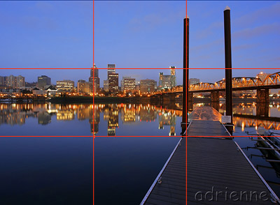
My own Rule Of Thirds Video.
Write a 300-500 word article that tells the audience about a recent multimedia technology that is being or has been developed in the last six months.
 Blu-Ray V HD-DVD.
Over The Last few months the long battle between the two high definition movie formats may have come to an end. Both formats were originally announced back in February 2006, with different movie studios taking sides. Blu-Ray was invented by these group of companies: Hitachi, LC, Mitsubishi, Panasonic, Sharp , Samsung and Sony. HD-DVD was created by Toshiba/NEC. http://www.blu-ray.com/ and http://www.toshibahddvd.co.uk/.
Both technologies use the same blue-violet laser, this means they can focus more sharply than a standard DVD, resulting in a higher quality picture. It also means that far more data can be stored on the discs. There are however bid differences between the discs. Blu-ray packs more data into a single spiral of the disc, this meaning that Blu-ray can fit more data onto each disc than a HD-DVD. The two formats are incompatible.
A blu-ray disc can fit about 25GB of data on a single disc only using a single layer. Double this can be fit on a dual layer blu-ray disc (about 50GB). HD-DVD can only fit 15GB single layer and 30GB dual layer, both these however are far more than a standard DVD which is only 4.7GB single layer and 9GB dual layer.
The most important thing for the consumers however is the price of each technology. For a product to be successful it obviously must function but also be affordable. Blu-ray is seen as a more advanced format, this means the price is quite high. Back in mid 2007 when both formats were competing a blu-ray player cost a staggering £450 while a HD-DVD player came in at £220, half the price. So which would the consumers go for? The more expensive but more widely used Blu-ray format or the smaller HD-DVD format. As time went on Blu-ray started to get more and more backing from the different film studios. The bigger studios were releasing their films on blu-ray rather than HD-DVD, meaning more films were becoming available on blu-ray and not HD-DVD. Because of this consumers were buying more blu-ray films, resulting in an announcement from Toshiba that they would no longer be producing HD-DVD technology.
http://business.timesonline.co.uk/tol/business/industry_sectors/technology/article2300109.ece
So now the battle between Blu-ray and HD-DVD is over can blu-ray takeover from DVD? This totally depends on the consumer. New chart DVDs now retail at about £14.99 while blu-ray discs come in at about £20. Will society be willing to spend extra on the same product for the better picture, specially in the current financial climate? The average blu-ray player is retailing at about £250 while a DVD player can be purchased for £20. Also, to take full advantage of the high definition picture a HD ready TV is needed also costing more money. Its up to the consumer, save money or spend more?
Tuesday, 4 November 2008
Monday, 3 November 2008
Think about what goes on in your head when you buy something new, take a photo of your favorite designed object and answer the following questions:
 Why is it that we want our belongings to do more for us than to function well?
I have recently purchased a new Sony Ericsson C902 mobile phone. I had a perfectly working mobile phone before getting this one, however. It didn't look anywhere near as good. I bought this phone due to both technical and aesthetic reasons. When i think about it though i would probably still have bought it if it had a 3 Mega pixel camera rather than the 5 it has, this indicates that i based my purchase upon the design.
In the current day it is not just enough to have something that just does its function, it has to do something extra, it has to look good while it performs its function. We want people to see what we have and think WOW! that looks amazing. Consumer goods are all based on looks and it is important to have your product 'accepted' by society. No one would have bought this phone if it wasn't aesthetically pleasing, even if it was the best functioning phone in the world!
Why are we willing, as soon as we can afford it, to pay extra for things with appealing forms?
While it is obviously important for things to function well and do more and better things it is vital that they look good. Going back to mobile phones, the most popular phones are those that look the best. We always want our things to look the best, people want to be able to pull out their mobile phone and people to look and be impressed by it. Everyone wants to have the latest design, when a new product gets released with maybe only slight alterations with its function but drastic design improvements it becomes must have and so much better.
Internet Problems!
Cant upload anything!!! Im not able to upload my pictures for the 2 peices of lecture work and youtube wont accept my pixilation video!! I blame my rubbish Megaclose internet connection....useless!!
What do you want to get out of the course, in addition to passing?
This year i am actually looking forward to starting, the course excites me and i cant wait to get started. I want to learn new skills and hopefully improve on the skills i already have. I hope to gain some Independence with my work and do what i want to do. I am used to being told what to do and how to do it, i want to cut free from this constraint and do my own thing.
A Fresh Start
Ive been here before. I started at Trent last year doing Product Design, however. After dong the course for the first term i decided it wasn't for me and dropped out. Even after dropping out i stayed in Nottingham and finished my year socially rather than academically. I think i should of taken an official gap year instead of paying £6k to just go out for a year! However, i now feel refreshed and ready to start a fresh doing Multimedia.
As i am obviously technically a fresher again all my friends from last year including my housemates werent, so i dint bother with a freshers band and i simply went out with them instead. I had quite a good first week back, managed to get out quite a few nights and also attend some freshers events.
Its quite strange living in a house with your friends, theres a lot that needs sorting out unlike last year! Living in halls there is nothing to worry about. Weve had to set up our gas, water and electric, sort out the internet and numerous other little things.
I am looking forward to the Multimedia course and cant wait to get started.
Subscribe to:
Comments (Atom)